Tag: stampin’ blends

Fun-N-Crafty | Country Lane Suite

Hello my crafty peeps! I’m happy to be here again this month as part of the Fun & Crafty blog hop. You should have arrived here from Stacey’s A Work of Carte blog. If you didn’t, not to worry the complete list is below! Today the Stampin’ Up! Holiday catalog is live and there are oh so many goodies! To kick off the new catalog, a few of us participated in a holiday catalog card swap to get even more creative ideas to share with you!

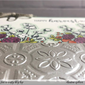
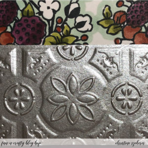
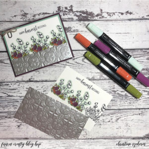
For my card I decided to use the Country Lane suite, which includes the Country Home stamps, Country Lane DSP, Tin Tile Dynamic TIEF, Braided Linen Trim, Chicken Wire Elements, Galvanized Clips, Galvanized Metallic Paper, and two new combo packs of Stampin’ Blends.I really love the versatility of this stamp set and the embossing folder gives so much detail, especially with the galvanized metallic paper. In the coming months I plan to use more of my favorites from the new holiday catalog in blog posts so stay tuned!

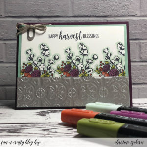
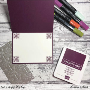
I started with a Blackberry Bliss horizontal top-folding A2 card base and because it’s a dark color I decided to include a white insert for writing a message to that special someone, which meant more stamping inside! For the card front, I began by cutting a piece of Mint Macaron to 4″ x 5.25″ for a mat and a Whisper White to 3.75″ x 5″ for the stamped panel. Next, I cut 6″ x 6″ squares of the galvanized metallic paper and ran it through the Tin Tile TIEF. I cut these into 1.5″ x 5.25 strips.


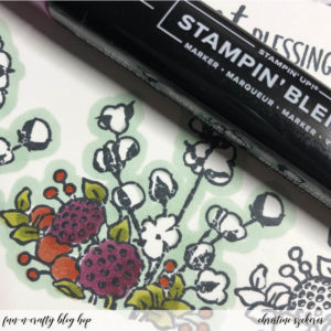
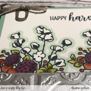
Using Memento black ink, I stamped the cotton flower image 1.45″ above the bottom edge three times on the panel. I also stamped the sentiment “happy harvest blessings” on the top of the panel. To make the cotton pop and look extra white, I outlined each stamped image using the light Mint Macaron Stampin’ Blend. I also colored the other parts of the images using the combo packs of Blackberry Bliss, Cajun Craze, and Old Olive Stampin’ Blends.


All that remained, was assembling the cards. First, I adhered the interior panel as well as the front Mint Macaron mat, the Whisper White stamped layer, and finally the tin tile galvanized strip. I clipped one of the cute galvanized clips to the panel and adhered it to the card base using dimensionals. For the final touch, I made a bow out of the braided linen trim and using a rolled up mini glue dot, adhered it to the top of the galvanized clip.


There is a ton of inspiration throughout this hop and I encourage you to grab your Stampin’ Up holiday catalog and some post-it notes, and visit the other talented crafters listed below to see what they created and perhaps leave them some crafty love! Up next is the wonderful Merit over at MB Squared Designs. Until next time, remember, creativity and imperfection live together in all we do. “Grace is the face love wears when it meets imperfection.”

~xoxo


  1. Stacey — A Work of Carte
  2. Christine — Artful Musings (you are here)
  3. Merit — MB Squared Designs
  4. Nicole — Inky Fingers Stamping
  5. Jennifer — NW Stamper
  6. Tobe — The Craft Sea
  7. Pamela — Stinky Tofu

Supplies Used:
Country Home Stamps (147678)
Tin Tile Dynamic TIEF (147906)
Galvanized Metallic Paper (147805)
Card Stock: Whisper White, Blackberry Bliss, & Mint Macaron
Ink: Blackberry Bliss & Memento
Blends: Blackberry Bliss, Cajun Craze, Old Olive, & Mint Macaron (light)
Accessories: Galvanized Clips (147806), Braided Linen Trim (147808), Snail, & Glue Dots 

2018 – 19 Stampin’ Up Annual Catalog

Confession time: I’ve been a bad, bad girl! Last November I had every intention of continuing my monthly series, Innovation Station, as well as regular posts and blog hops. After all, crafting keeps me sane. Early in November a trip to On Stage in Salt Lake City took me out of town for nearly a week and then my best friend moved (and I had to help – that’s what it means to be best friends for nearly 30 years – you bury the bodies and you help move). Once that was all sorted it was Thanksgiving and then Christmas. So no blogging for two months. Okay, not so bad, right?

I promised myself I’d get going again in January, but as the early months of 2018 rolled by, it became clear that blogging (and even more disturbing) being creative were the casualties of life taking a sharp and unexpected turn in the middle of March. After nearly nine years, I was laid off from my job, which is scary enough on its own, but it also meant I had to move since my home was provided by my employer (yes, I was super fortunate). You would think being unemployed would leave lots of time for crafting, but aside from two weeks of binge-watching TV as I put off processing what it meant to be unemployed after nearly a decade, my life has been surprisingly busy. Busy getting ready to put most of my things in storage and take over my best friend’s spare bedroom, busy looking for a job, busy trying to figure out health insurance (not a simple task).

Once I got moved, I was able to begin picking up the threads of my old life, including being creative. My best friend kindly let me take over a big part of her living room for my crafty zone (a table and a small Origami unit that holds the few stamps, inks, paper, and dies I kept out of storage). Can I tell you how hard it was to fill two 66 quart totes and nothing more? Just today I realized that I forgot to keep out envelopes. Envelopes. I can’t believe it! I went to storage but didn’t have the energy to dig through all the totes to find the one with the envelopes so I’ll just have to buy another package. *sigh*

As a Stampin’ Up! demonstrator I always look forward to the new catalog but given that I was in full packing/purging mode, 5′ high in bins all around my house, for much of May, I really didn’t think too much about the fact that there were 241 pages of new and returning goodies to ‘oh and ah’ over! The one great thing about being settled (at least until August when the bestie moves to Endicott, NY) is I’ve been able to figure out what I’m most excited about from the new catalog.

So, without further ado, my top ten list (plus one honorable mention) of 2018 – 19 annual catalog goodies:

  1. Tropical Escape Suite (p. 121)
  2. Tufted Dynamic Embossing Folder (p. 223)
  3. Stampin’ Blends (p. 205)
  4. Share What You Love Suite (p. 177)
  5. A Big Thank You (p. 122)
  6. Stamparatus (p. 207)
  7. Animal Expedition Suite (p. 27)
  8. Garden Impressions Suite (p. 129)
  9. Friendly Conversation (p. 117)
  10. Artfully Folded (p. 228)
  11. Honorable Mention: Simply Shammy (p. 206)

Wondering why I love these things? Well, give me a bit more of your time and I’ll tell you…

I initially ignored the Tropical Escape suite, but the more I looked at the stamps and the dies, the move in love I fell. The leaf dies have inner and outline dies, making them super versatile. The DSP and the Tropical Elements flowers and leaves are beautiful as well, making this suite a win-win! The Tufted embossing folder is so pretty and when paired with tiny pearls or rhinestones, takes the look to a whole new level. I like the simplicity of the Stampin’ Blends, who wouldn’t, alcohol markers, one light and one dark, designed to blend. My main complaint when they debuted last fall was the palette was very limited. Coming out with 11 new colors was a solid expansion of these markers. I’m in love with Granny Apple Green and Flirty Flamingo.

The Share What You Love suite was the early release this year, out to demos in April and customers in May. This suite has wonderful images and sentiments as well as a double pack of specialty DSP! The bundle A Big Thank You might be something you miss flipping through the catalog, but don’t – there are great sentiments as well as builder images in this set! I often forget that the Stamparatus is new to customers since I first learned about it at On Stage last November and had one in my hands in February. With its stair-step dual plate configuration, you may wonder how you ever got along without it! I didn’t go to On Stage in April, but those who did, kept raving about the Animal Outing bundle and I agree — it is super cute. The whole suite is full of wonderful goodies including leaf ribbon and unique dies that cut both the stamped images and images from the DSP! 

I believe the Garden Impressions suite might be the sleeper suite of the catalog – I’ve seen one of the stamps used as giraffe or leopard print – these stamps are certainly flexible and the dies are intriguing since they can be used with the embossing mats, giving you so much flexibility with these intricate and beautiful dies. Pretty and vibrant DSP, the Metallic Ribbon Combo Pack, and Blooms Elements round out this beautiful suite! Friendly Conversation is an unusual set with just two, large sentiments, but they are interesting enough to be the focal image of a card! I don’t normally fall in love with hostess sets, but Artfully Folded, which is origami images is so fun and playful, what’s not to love?!? The Stamparatus makes this set loads of fun! The Simply Shammy comes along a while after other shammies but as usual, Stampin’ Up! looked at what was on the market and then innovated and the result is a very thick and resilient shammy that gets stamps (particularly photopolymer) as clean as a whistle! Bonus: it fits perfectly inside the standard SU stamp case and since it’s not airtight you don’t need to worry about mold or mildew!

Thanks for hanging out with me today and listening to what’s new with me! I hope to begin innovation station this month (next week). Until next time, remember, creativity and imperfection live together in all we do. “Grace is the face love wears when it meets imperfection.”

~xoxo

Innovation Station | Stampin’ Blends

Hello my crafty peeps and welcome to another Innovation Station post, a monthly feature focusing innovative tips and tricks. Each month I share an innovation that I find myself going to again and again. 

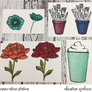
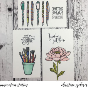
This month’s innovation was going to focus on watercolor backgrounds, but instead I wanted to share about the new Blends alcohol markers. When the new Blends markers were announced a couple of weeks ago I was resolutely in the “I’m not going to invest in these” camp for the simple reason that I have hundreds of COPIC markers. I love my COPICS, they are by far my favorite for coloring medium and I thought, “I don’t need more alcohol markers…”. I stayed in the “no” camp until late Sunday two weeks ago when I decided I would order the set to do a comparison: COPICS vs Blends. I’m so glad I did. The left photo shows the first images I colored on Saturday and the right shows the images I did specifically for this post.
  

I wrote up my comparison on the demonstrator FB group this past weekend, but decided to dedicate this blog to the topic as well since I’ve played a bit more and as the discussion unfolded on FB, I refined my opinion. For those who want the bottom line right away, here are the pros (in green) and cons (in red):
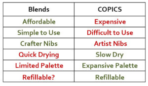
For those who like the details, please feel free to review the below for additional information:

  1. The compound in the Blends drys faster than COPICS, which means you have to work in smaller increments, going back and forth between light and dark. The main time this is an issue is when working in very large areas (see the coffee cup).
  2. The brush tip on the Blends isn’t as flexible or resilient as the COPIC brush tip. As I was working on the coffee cup I noticed that when using the flick technique to blend the light and dark shades, the brush tended to fracture and get “bent out of shape”, creating uneven strokes.
  3. In some of the color groupings, specifically Bermuda Bay and Cherry Cobbler, there isn’t really any difference between the light and dark shades meaning the light is very saturated and dark. This means achieving shadows and depth can be challenging, especially in small areas. That being said, both colors are lovely despite being too close in saturation level.
  4. The BIGGEST benefit to the Blends, and it’s an important one, is their simplicity. If you know anything about COPICS, you know there is a very complex letter and number system and you must understand this system to choose blending colors properly. You can’t just blend any two greens together. It is probably the most daunting thing about COPICS (aside from the cost). Fortunately, SU has engineered the Blends in blending groups and with the exception of the two colors listed above, all the duos blend beautifully. No muss, no fuss, and zero confusion. For anyone new to alcohol markers this is HUGE!
  5. COPICS were originally a fine artist tool. Crafters came along and began using them, but they can be expensive and are not really designed for crafters. Take the nibs, COPICS come with a brush and chisel nib. I NEVER use the chisel nib (does anyone). COPIC finally introduced a bullet nib, but you have to buy and replace the chisel nib and that is just more expense. Blends have the best nibs for crafters, the brush and bullet, and that is another BIG selling point.
  6. COPICS come in over 300 colors. While that is an amazing array of color, it is often daunting and also overkill for most crafters. The initial set of Blends creates a good palette and if (here’s hoping) they add a few more colors the Blends will be a solid coloring set of markers, far fewer than the 350 or so in the COPIC family, which makes Blends more accessible than COPICS.

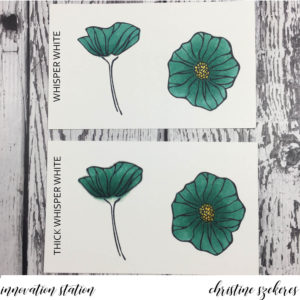
I did my initial testing on Neenah Solar White 80# card stock (the left photo above) because this is what I use for all my Copic work. I went back and did all the tests again using Whisper White and Thick Whisper White card stock (photos below and the right photo above). The clear winner: plain WHISPER WHITE. The colors tend to deepen, losing shadows and light, on thick whisper white — a lighter hand with the markers might help with this. Thick WW tended to have more issues with “bloom”. Alcohol markers tend to seep into the paper slowly and that can cause bloom (where the color goes outside the lines of your stamped image). Bloom happens a lot when you are going over an area multiple times blending colors.

Some bloom can be corrected with the Color Lifter, but you have to be careful because the Color Lifter doesn’t really erase ink, it actually pushes ink, which is why you can come back to a piece that you used the Color Lifter to correct bloom and have a “halo”, a ghostly looking edge of color slightly beyond the area where you had bloom. Halo can happen on any type of paper (see the top orange pot for an example of halo).
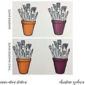
I did several tests trying to lighten the dark colors, especially Bermuda Bay, using the Color Lifter:

  1. going over the image with the Color Lifter after the light and dark were laid down (see poppies in left photo above)
  2. scribbling the light or dark marker on a craft sheet and picking it up using the Color Lifter (side-facing poppy on TWW below)
  3. and laying down a layer of Color Lifter before putting either the light or the dark color down (the other 3 poppies in the image below)

Technique 1 did lighten the color, but in a very splotchy way, technique 2 ended up with bloom and halo, and technique 3 resulted in lighter color and smooth blending. The clear winner: technique 3

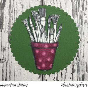
There are a lot of neat things you can do with the Color Lifter, but one of the simplest is using it to create patterns in your colored images. Here is a simple example of this. I will delve deeper into the Color Lifter in a future post.
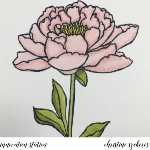
HINT: alcohol coloring tends to smooth out over time. You might be convinced that something is a disaster, but I encourage you to set it aside for a few hours. You will likely be surprised how good it looks when you pick it up again. I was really unhappy with this pink flower, but after an hour or so, the color had settled and I thought it looked much better!
Overall, I am happy with the new Blends. I do have a few wishes: lighten the lights in Cherry Cobbler and Bermuda Bay, add a few more colors, make the nibs replaceable, increase the quality of the brush nib, and the marker refillable. I have a secret hope that the refill (if available) will not be a bottle of liquid but a new internal cartridge. If you’ve ever refilled a COPIC and had ink go everywhere but inside the marker, then you know why I think this is the way to go. 

A word about paper and ink. I’ve tried Whisper White with my COPICS and never really cared for the results. I think this may have something to do with how long COPICS stay wet. I’ve had issues with warping, pilling, and bloom when I’m really working on blending several layers. I have not had these same issues when using the Blends on Whisper White, I actually prefer it over Neenah Solar White. I have two inks I use for all of my COPIC work: Memento Tuxedo Black and Simon Says Stamp Intense Black Premium Dye ink. Both produce crisp results with no danger of bleeding once you begin applying color. For all of the examples here I used Memento Tuxedo Black ink since that is what is available from SU.

Thanks for hanging out with me, and learning (or relearning) a fun innovation! Join me next month for another of my go to innovations, shaker cards. Until next time, remember, creativity and imperfection live together in all we do. “Grace is the face love wears when it meets imperfection.”

~xoxo

Supplies Used:
Stampin’ Blends Alcohol Markers
Ink: Memento Tuxedo Black
Card Stock: Whisper White & Thick Whisper White
Stamps: You’ve Got This, Coffee Cafe, Crafting Forever, & Oh So Eclectic